

Dan Antonelli, writing for SignCraft Magazine, says that whenever he’s designing a new brand for a client, he’s always talking to them about the importance of owning their brand colours.
I guess that in theory every company owns their brand colours, but the real question is: are they the sole owners of their brand colours? That’s the bigger question. If their colours are the same colours as their competitors, then they really don’t own their own unique colours.
Their colours are potenially being confused with their competitors. For example, if your competitors’ vans are predominantly yellow, why would you want yellow vans as well?
Colours and brands work in harmony to trigger recognition for a company in the minds of the consumers they are trying to target. Obviously, in theory, there’s an almost unlimited combination of colours designers can choose when picking a brand colour scheme. However, so few businesses choose colour combinations that are unique. Instead, they choose ‘safe’ colours that they’ve seen used over and over again.
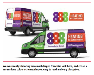
Safe decisions tend to yield safe results. But bold decisions usually yield bold results. Common colour schemes are really tough to truly own. For a Heating, Ventilation and Air Conditioning (HVAC) company, which colour scheme is ownable? Red and blue, or apple green and purple? The safe choice is red and blue. The bold choice is apple green and purple. Which would be more disruptive in the competitive landscape? If everyone else is going in one direction, that’s usually a good indication that one should go the opposite way—unless, of course, your goal is to blend in. Then by all means, go the safe way. But usually, the goal for businesses who invest in wraps and fleet branding is to actually stand out, not fit in.
Here are some tips on choosing colours for your clients, and helping them own their own colour schemes:
Do the research. We always start the brand process by reviewing all of the client’s competitors’ current brands and vehicle wraps. It’s important to use this research to help formulate the colour strategy.
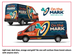
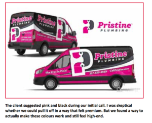
Think out the colour choices. We’re often trying to put two or three colours together which typically do not actually belong together. That sounds fairly counter-intuitive, but that’s how you wind up creating unique brand colours. The more unique, the more ownable.
Plan for ancillary applications. Keep in mind that the colours chosen have implications beyond the vehicle. It will become part of their brand identity and need to be used on everything from uniforms to websites.
Consider environmental factors. We recently branded a company in Texas who was very fond of red, white and blue. Nearly every competitor was using red, white and blue. Outside of the colours so closely tied to Americana, it’s also an integral part of the Texas flag. So once again, if everyone is using the colours, it’s going to be harder for us to stand out. So we branded them with dark green and ivory. And you can bet no one had those colours in their space.
Remember that bold wins over obnoxious. Being bold is a good thing, but be careful your colour scheme doesn’t scream for attention while simultaneously cheapening your brand and looking amateurish.
Convincing clients to go with something other than the tried and true colours they’re accustomed to takes some education. Helping them understand the benefits of owning their own brand colours and how the wraps will help them gain recognition in their community will go a long way towards that—and help them realise that they are dealing with someone who cares about the success of their brand.
Published with permission from SignCraft Magazine.
Submit your news and video content to journo@practicalpublishing.co.za
Subscribe to our YouTube channel, read the top 5 stories weekly on WhatsApp or sign up to our newsletter.


